Time, meet money.
1/ Context
Solo is my own concept, currently in development: an iOS tracker for freelancers and hourly workers — mostly young people juggling shifts, gigs and the occasional side income. They know their hourly rate; what they don't know is their real number: what today actually earned once tax is set aside and the coffee, transport and groceries are subtracted.
The ambition behind the app is bigger than tracking. It's a tool for a conscious relationship with time and money: see what an hour is really worth, watch the day's net build in real time, and learn to think in two horizons at once — today, and the long run.
2/ The concept
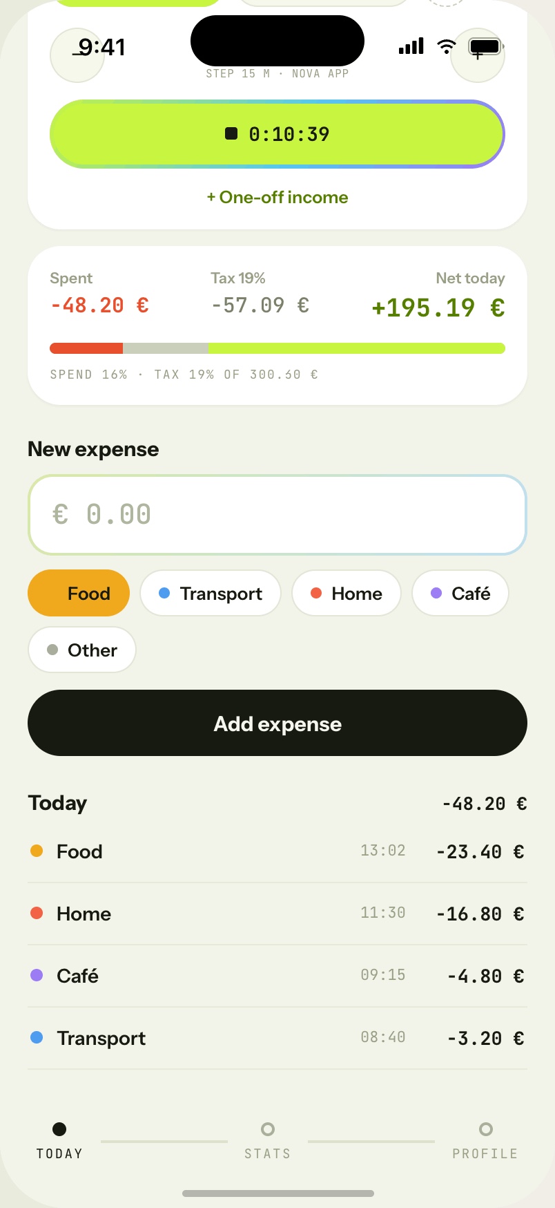
- One number to rule the day. The home screen joins a running work timer and today's spending into a single live metric — net today: earned, minus tax, minus spent. Not the optimistic gross; the money that is actually yours.
- Tax is not a footnote. A flat-rate preset is applied to every euro as it's earned, so the tax share is set aside before it ever feels spendable. The nasty spring surprise, designed away.
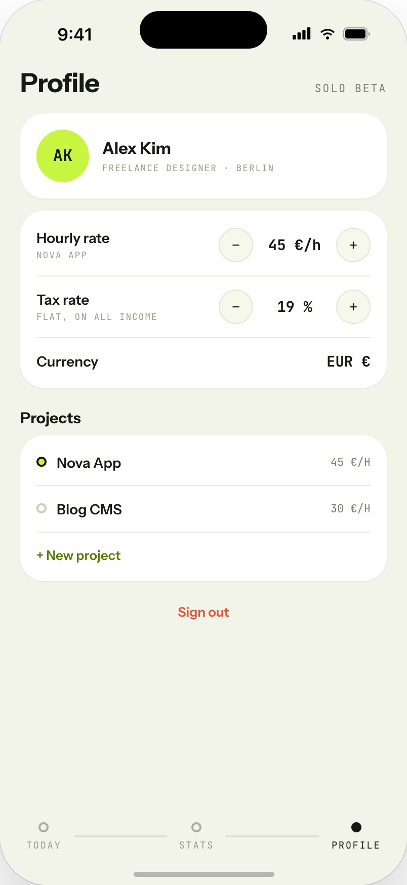
- Friction where it teaches. No bank link — on purpose. Logging €4.80 for a coffee in two taps is the product: the small act of typing it is what builds awareness. Everything else — category chips, project rates, one-off income — is tuned to stay out of the way.
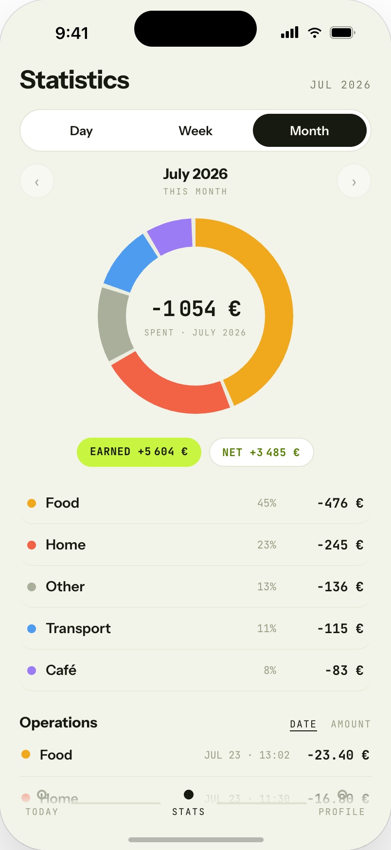
- Two horizons. The same data reads as a day pulse and as a Day / Week / Month picture — where the money went, what stayed — so short-term choices and long-term habits meet in one place.
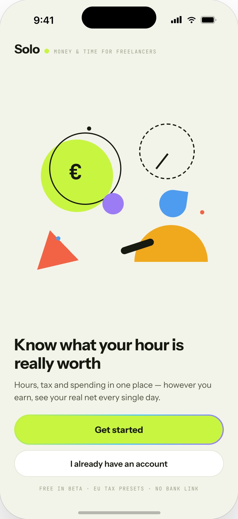
- A brand that isn't a bank. Warm paper, bold geometric shapes, a lime accent and mono numerals — bookkeeping that feels like a habit tracker, not accounting software. Built for people who'd never open a finance app.
3/ Screens
4/ Outcome
Solo is in development, with the concept and design complete — the brand, the interaction model and every screen are mine end to end. It's the kind of product thinking I bring to client work, pointed at a problem I care about: helping people who trade hours for money treat both as something worth counting.
Building a product for an audience banks can't reach?
Let's talk →