One list, one screen.
1/ Context
Rimi is one of the biggest grocery chains in the Baltics — and my own everyday store. So when I was asked to rethink their Scan & Go app and find its weak points, I had the best kind of brief: a real product, used by millions, that I also happen to live with. I could audit it as a designer and feel it as a customer at the same time.
Two problems stood out. The shopper's attention scatters — the list, the deals and the scanner all live on separate screens, so people lose the thread of what they actually came for. And a familiar chain in an unfamiliar branch is genuinely disorienting: I've watched myself, and others, drive the extra kilometres to a known store just to avoid getting lost in a new one. That's a real retention problem hiding as a small annoyance.
Independent concept — a self-directed redesign, not affiliated with or endorsed by the brand. Prices and product data are illustrative.
2/ The idea
Keep the customer's focus on their list, while quietly making the store work in their favour. Three moves do most of the work — and two of them are things competitors simply don't offer:
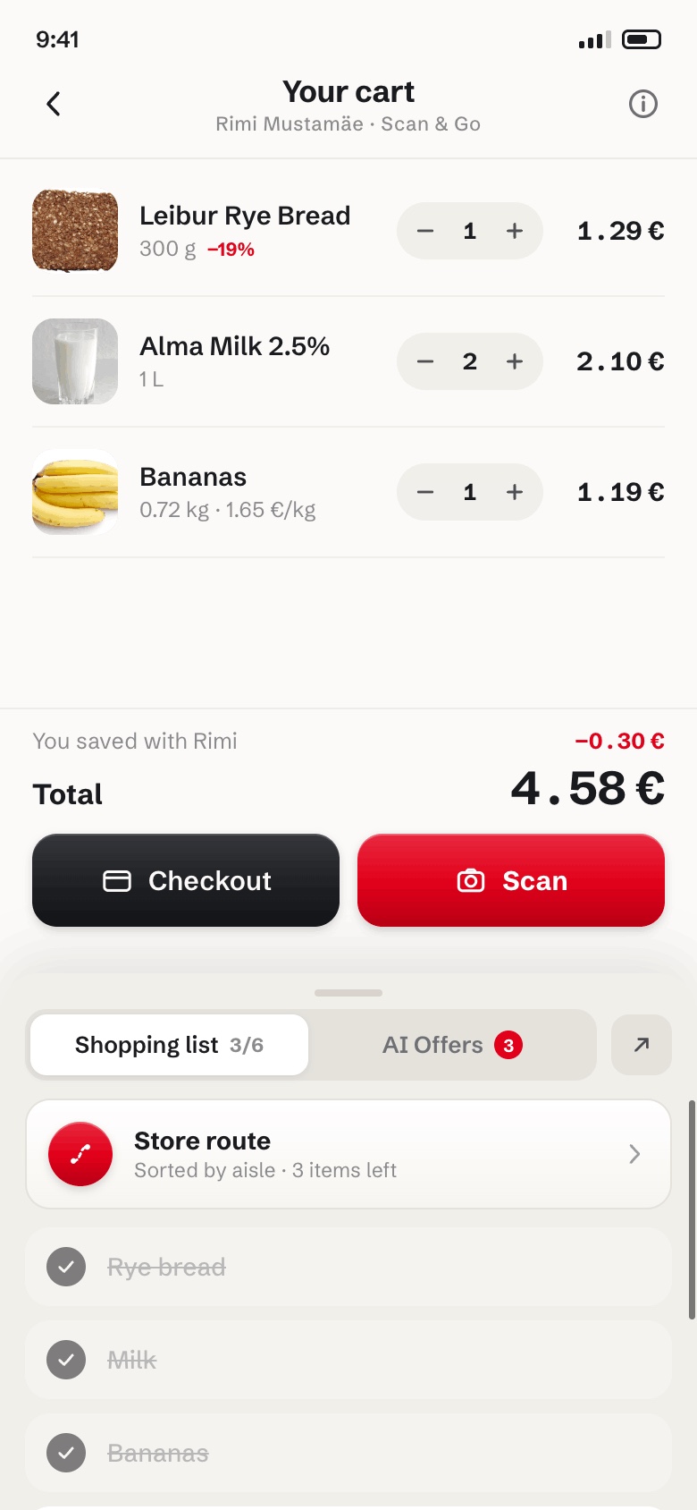
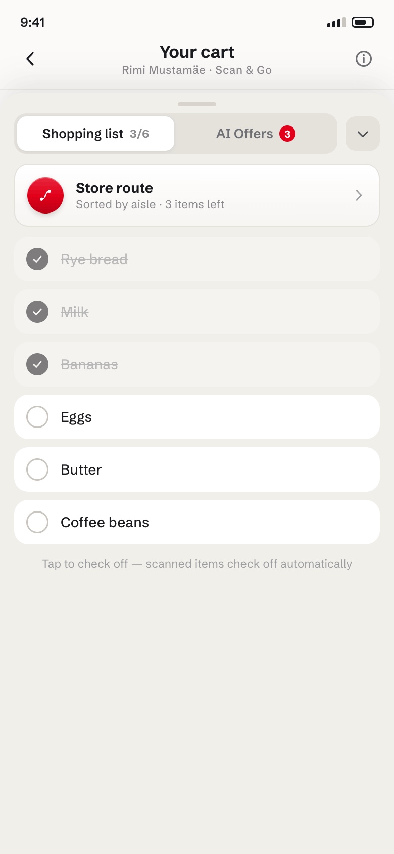
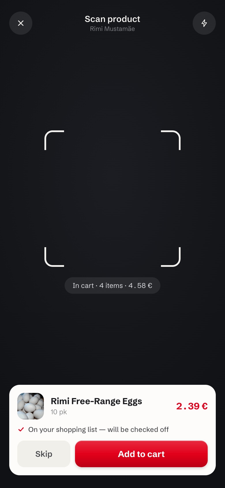
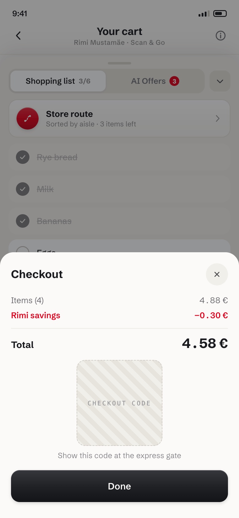
- Cart and list on one screen. A pull-up sheet keeps the shopping list, matched deals and the route attached to the cart itself — no tab-hopping. Scanned items check off the list automatically, so the plan and the basket never drift apart. Competitors split these across screens.
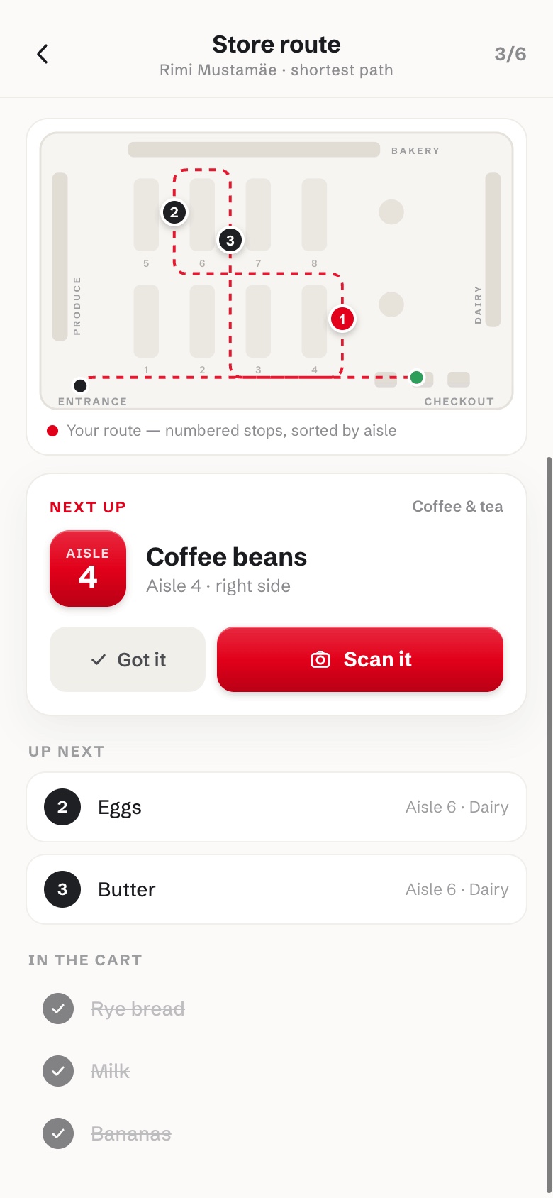
- A route map for the store. The list becomes a numbered, aisle-sorted path from entrance to checkout, with a live floor map and a "next up" card. Walk into any branch and the app knows the way — the feature that quietly kills the drive-to-the-store-I-know habit. Nobody else has this.
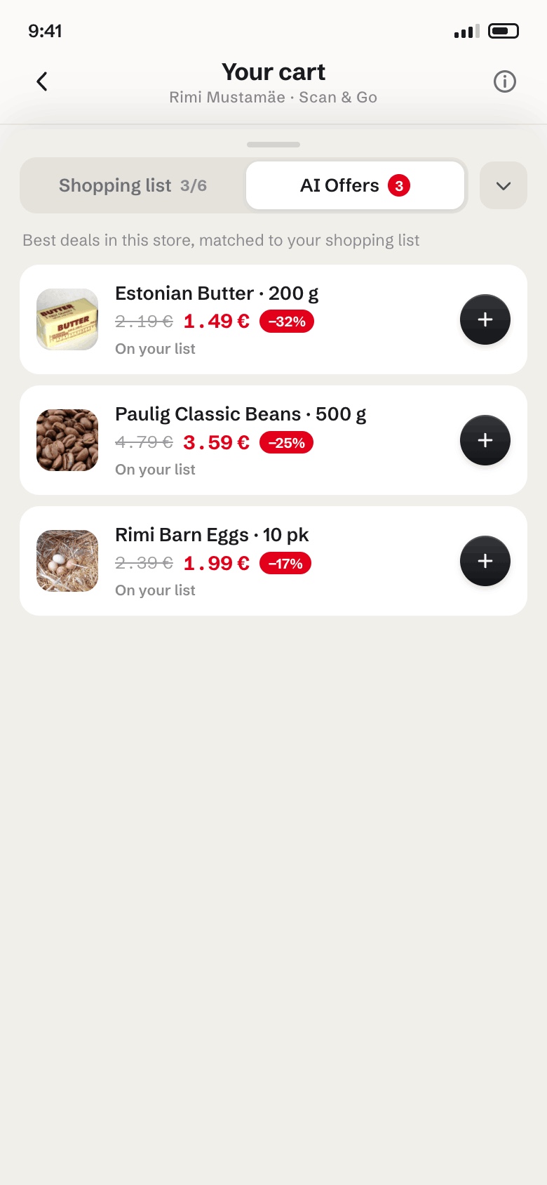
- Deals that respect the list. An AI Offers tab surfaces only the best in-store discounts matched to what's already on the list — savings without turning the trip into an ad. One tap adds them; the running total and "you saved" stay honest.
3/ Screens
4/ Outcome
The redesign turns Scan & Go from a checkout shortcut into a guide for the whole trip: one screen that holds the plan, the savings and the way through the store. It's a case where being the product's own user was the research advantage — the friction I designed away was friction I'd felt in the aisle myself.
Have an app your customers tolerate more than they love?
Book a walkthrough →