Conversion, step by step.
1/ Context
I've designed the customer-facing side of e‑commerce for a range of brands — from grocery retail (Selver) to travel (Tallink) and several smaller shops. This example is a car-parts store: a domain where the whole game is getting a visitor from "will this part even fit my car?" to a confident checkout, across a catalogue of thousands of near-identical SKUs.
The brand is under NDA, so the logo and names are masked — but the storefront, the flows and the patterns are exactly as shipped.
2/ What I owned
The exact remit shifts from project to project — on this kind of engagement I've owned some or all of:
- User metrics & research. Defining the funnel, watching where it leaks, and running the research — interviews, surveys, session and eye-tracking review — to know why.
- The design system. A component library that keeps a thousand-SKU catalogue coherent and lets the team ship fast.
- A/B testing. Framing hypotheses, designing the variants, and reading the results to statistical significance.
- Delivery oversight. Front-end practices and review of the build against the design, through to release.
3/ How I lift conversion
I don't guess at conversion — I benchmark it. I go deep on industry benchmarking and lean on documented best practice, especially the Baymard Institute research on e‑commerce UX, combined with my own library of e‑com patterns built up across projects.
Every design is judged the same way: by the conversion of each individual step and by the final conversion at the end of the funnel. If a step leaks, that's where the next iteration goes — reassurance where users hesitate (fitment, stock, delivery, returns), friction removed where they drop.
4/ Screens
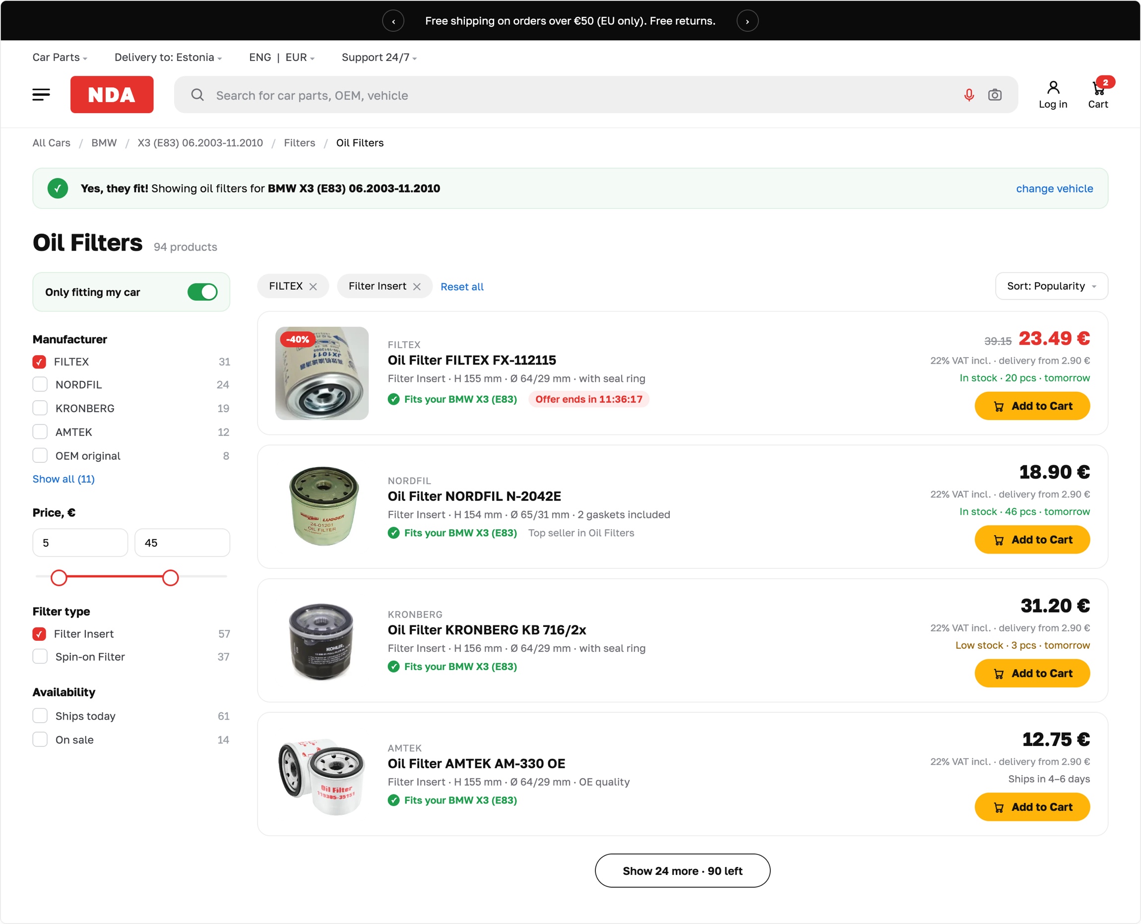
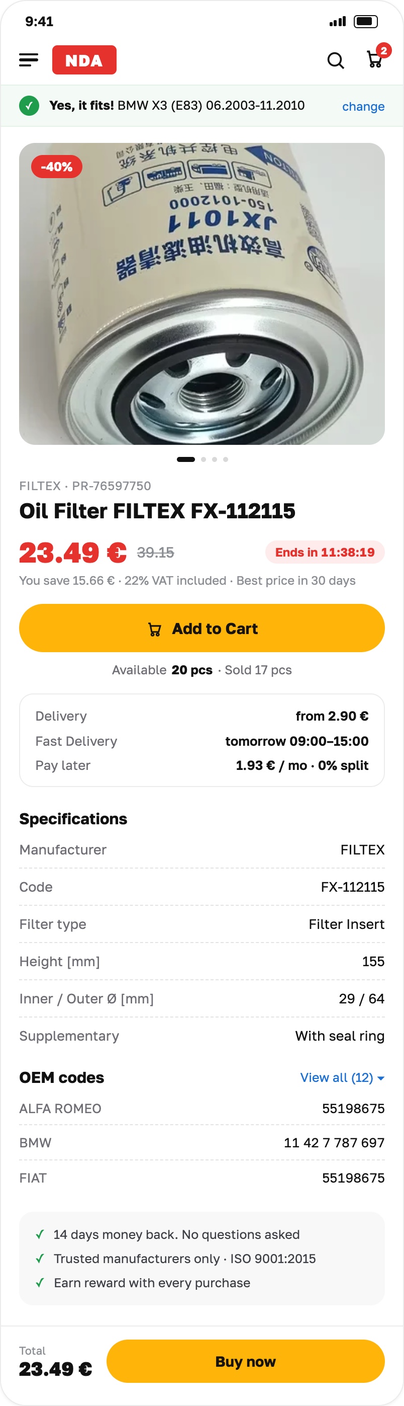
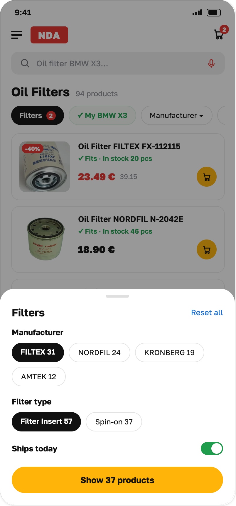
5/ Outcome
Shipped as a living storefront and design system, measured the only way that matters: step conversion and final conversion, moved and held through A/B testing rather than opinion.
🔒 Specific figures are under NDA — happy to walk through the funnel and the tests in a call.Want this kind of thinking on your storefront?
Book a walkthrough →