Signal, not noise.
1/ Context
The product scans a company's Java fleet — over a hundred JVM instances, JDK 8 through 21 — and flags known vulnerabilities in the components running on them. The engine was strong; the dashboard wasn't. It presented findings as a flat CVE list: technically complete, practically unreadable. Engineers spent their time working out where to look instead of fixing.
My brief was to rethink the dashboard from scratch so engineers find real problems faster — data visualisation first, and a clear prioritisation of the things that actually get vulnerabilities fixed. My part of the project was the research and the UX/UI; the client is an international company, so the brand and the data here are masked.
2/ The work
- Research with the people in the trenches. Sessions with security analysts and Java engineers about how they actually triage: what they check first, what they export to spreadsheets, and which questions the old screens couldn't answer.
- Reframe the priority. The key insight: severity alone doesn't rank the work. A critical CVE in a library nobody calls matters less than a high one on a live execution path. The redesign leads with reachability and fleet impact, not just CVSS numbers.
- Charts that answer triage questions. Every visualisation earns its place: the CVSS distribution shows how bad the backlog is, disclosure-vs-remediation shows whether the team is keeping up, predictive analysis flags which components break next.
- The Fleet Matrix. The centrepiece — components × JVM instances as a reachability heatmap. Hue encodes severity, opacity encodes reachability confidence; a filled cell means vulnerable code sits on a live path. One screen replaces a week of cross-referencing.
3/ Screens
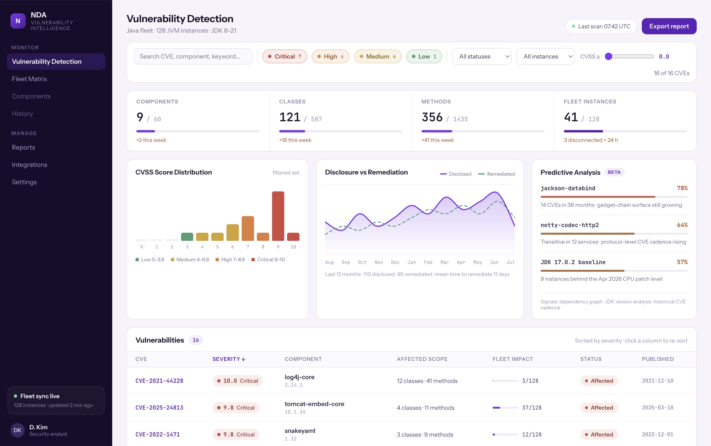
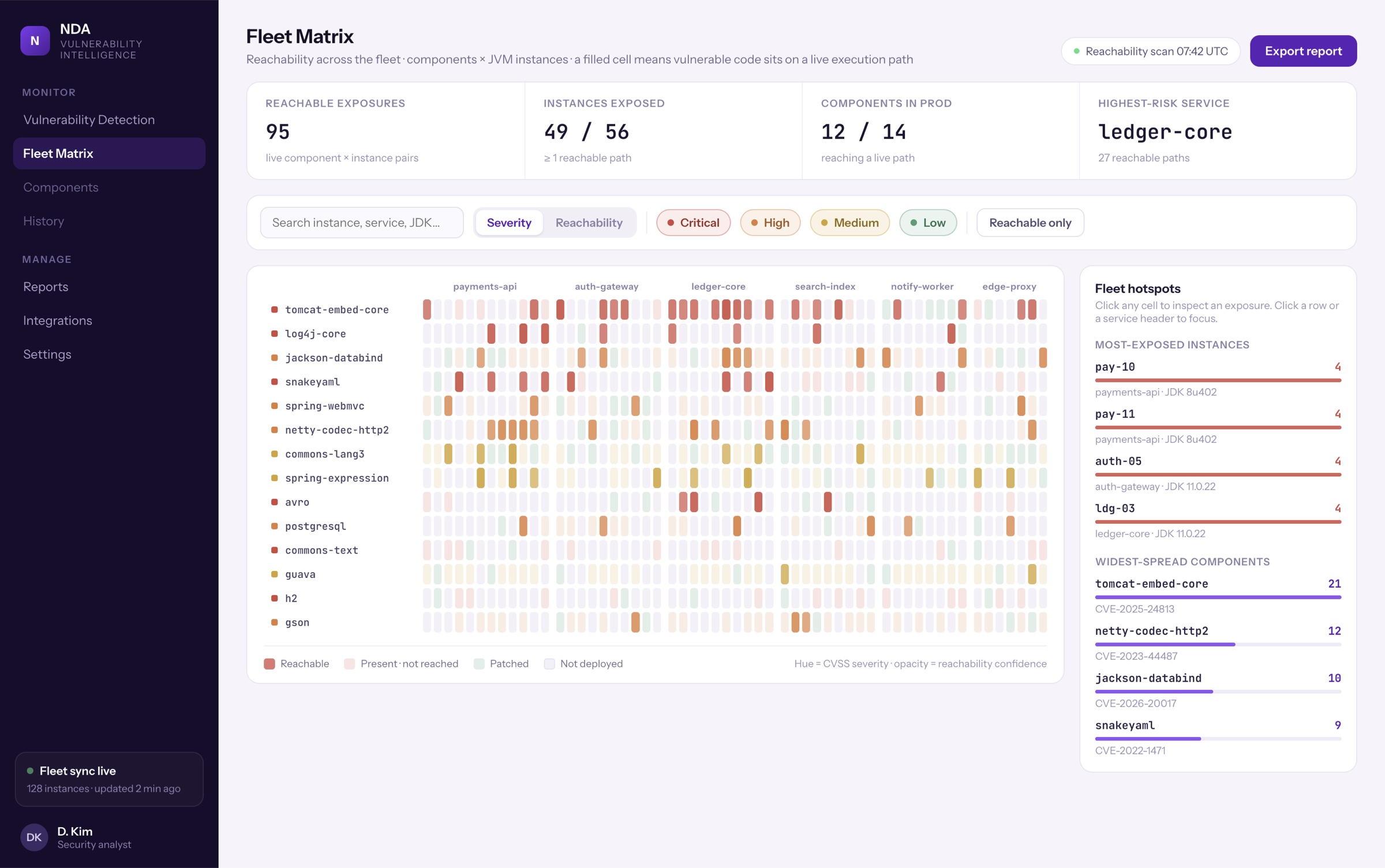
These are stills of a working prototype, not a mockup. Switch to Live demo to filter, sort and walk the fleet matrix yourself. It's a desktop tool, so it needs a wider screen — open the prototype full‑screen to try it.
The real thing, running: search and severity chips filter every panel at once, the CVSS slider narrows the set, table headers re-sort, and the sidebar switches to the Fleet Matrix. Data is masked — the behaviour is not.
4/ Outcome
The dashboard now answers the only question that matters in the first ten seconds of a session: what do I fix today? Sixteen open CVEs arrive as an ordered, reachability-ranked to-do instead of a wall of red — and the arguing about priorities moved from meetings into the interface.
🔒 Specific numbers are under NDA — the full story, research artefacts included, is available in a call.Drowning your engineers in data instead of answers?
Book a walkthrough →